
Did you know there’s a shark themed badge on Trailhead? It’s a project about hunting prospects and closing deals lightning fast. And it has a shark fin circling money on the badge, so that’s rad. But I’m not a closer, I’m a builder, and I’ve been watching #sharkweek all week on Discovery. Have you?! I really loved their new show, Shark Academy, where 8 people were training to join a shark expedition. And I loved Brad Paisley playing his guitar under water – that was super fun.
One of my least favorite shows was the Jackass one. The whole time I was like WHAT ARE THEY DOING SOMEONE IS GOING TO GET HURT and then during the very last stunt, someone got bit by a shark. Now obviously this attack was provoked by a guy literally jumping over some sharks on water skis, but it got me wondering how other attacks happen and how often. So what did I do? I went looking for data! I found this data from Global Shark Attack File that’s pretty interesting, AND it already included the attack from the Jackass stunt!
Data Prep
After I downloaded the file it was pretty obvious pretty quickly that there was a lot of cleaning to do! Not gonna lie, I definitely didn’t do all of it, but if you’re interested in playing with it, here’s the list of stuff that I thought needed to be done:
- Clean and transform the report date – some of the rows had open text and none of it was actually formatted as a date.
- Clean and transform location data – it is listed as countries, but not in a standardized way. Countries needed to be matched and uniform and ultimately, updated to the way they are listed on my map components.
- Clean and transform activity data – this was actually pretty okay, but you could tell they were trying to standardize after a lot of years of just writing whatever.
- Clean up the sex column – it should have been just M and F, but some rows had extra spaces, some had ‘M x2’, etc.
- Evaluate which columns were filled in enough to use – a lot of columns, like ‘Time’ were not very complete. Very few rows had this data filled in, so I knew right away that I didn’t want to use it, even though that would have been cool to look at. Another column that would have been really cool was the ‘Species’ column! Unfortunately, there were a lot of blanks and what was there was not actually the name of a species, it was more like “2-3 foot white shark”.
- Injury could probably be cleaned up to body part(s) involved or generalized to just Fatal or not. Or split this into two columns for both.
The final columns I ended up using from the dataset were:
- Date
- Country
- Sex
- Activity
- Type
- Injury
To try not to be completely insensitive while I’m “playing” with this data, I also removed watercraft accidents and other large disasters.
Choosing a Color Palette
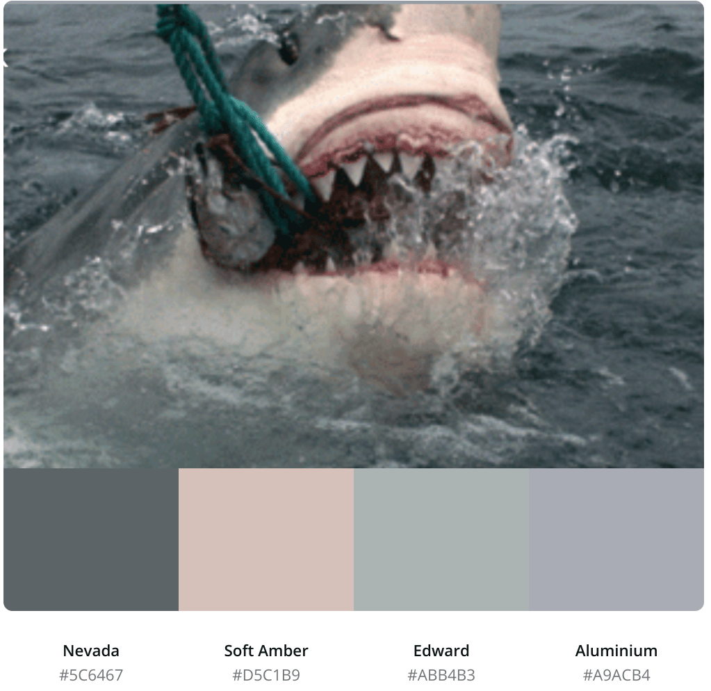
The first thing I did when I started building was find a rad shark gif because I knew I wanted to add some pizzazz to the dashboard! Once I picked my favorite one, I took a screenshot of it and uploaded it into the color palette generator on Canva so that I could have matching colors that looked great. If you haven’t used this tool before, I totally recommend it. I know at least for me, using the same old blues and brand colors gets boring and sometimes I just want to mix it up!
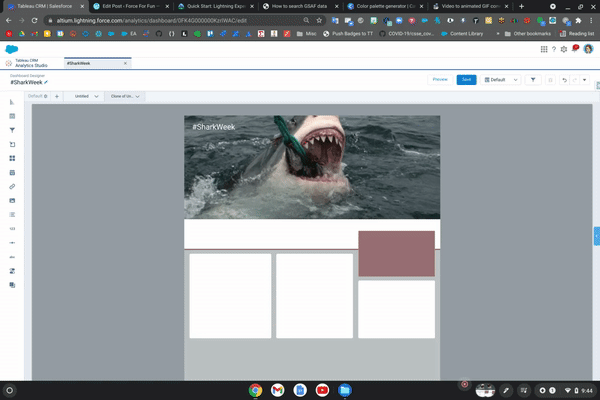
Layout
When I’m building a new dashboard, I usually like to put together some sort of wire frame before I actually start querying the data. This makes it faster to move things around and get a feel for what the final product may look like. I knew I wanted to really pop “above the fold”, or before you need to start scrolling down. I think I made that happen! Since my gif was sort of small, I set the dashboard width to 800 pixels so that my gif would always look great and not stretched out.
The Disclaimer and Then Some Data
Keep in mind here that I am not a scientist nor have I ever studied sharks. My entire shark education has come from watching Shark Week every year and so my perspective of this data is completely from a place of having fun and getting to use this awesome shark gif in a dashboard. I also have no idea how accurate or complete this dataset is that I downloaded, so please, don’t make any decisions about ocean activities or sharks by looking at this dashboard! Also keeping in mind that there are a lot of fatalities in this data, I hope I don’t come across as super insensitive and it’s definitely not my intention to offend anyone.
Again, not knowing anything about actual sharks, I just started playing with the data I had. Group by something, see if its interesting and then move on. I settled on a few different questions I wanted to try and answer:
- Have there been more or less attacks over a certain period of time?
- Are attacks typically provoked like in the case of the Jackass stunts, or not?
- What activities were people doing when the attack happened?
- What is the most common injury?
- Which sex has the most attacks?
- Where do attacks happen the most?
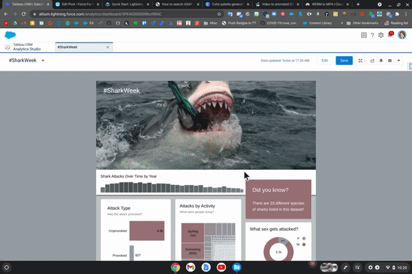
Keeping it simple and keeping it fun (and remembering it probably doesn’t really mean anything), here’s what I put together!
Maybe next time a #Sharknado dashboard? Or maybe I should stick to my business data 🙂

How did you get to control components (add a gif) and placement on the Dashboard? Where did you build that wire frame? When I open a new SFDC Dashboard, I can add components based on Reports and must adhere to the SFDC dashboard placements. How do I change that? Is this coding? I don’t do that.
And I have used and LOVE the Canva color palate generator. You’ve got a GREAT use case here!
LikeLiked by 1 person
Hey Jen! This was built in Tableau CRM (formerly Einstein Analytics) so you have way more flexibility and creative control. 😎
LikeLiked by 1 person
Thanks! 🙂
LikeLiked by 1 person